A whisky brand owner and a whisky shop owner decided to build the event they wanted to go to themselves. Whisky Freedom Festival Warsaw. Our job was to give it a face.
The festival had a clear purpose: promote Polish and international whisky, give new brands a stage, and make room for tastings, education and the conversations that happen between people who care about the same thing. Open and inspiring, but prestigious. Relaxed, but not cheap.
So the visual concept had to carry three words at once: freedom, passion, elegance.
The logo
The starting point came from the client. His whisky shop, Docent Procent, already had a barrel in its logo, and he wanted the festival to grow from it. We drew two directions from that barrel: one bold and rough, one old-style and elegant. The client chose bold.
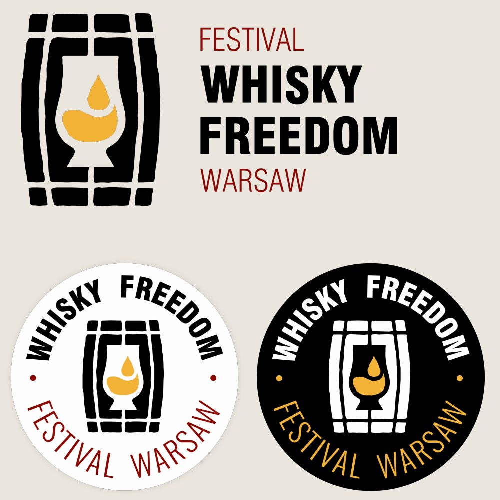
The rectangular mark and the round stamp.
Then he couldn't choose between a rectangular and a round version. So he got both: the rectangular mark leads, and the round one works as a stamp on posters, stickers and anywhere a badge reads better than a line.
One barrel. Two shapes.
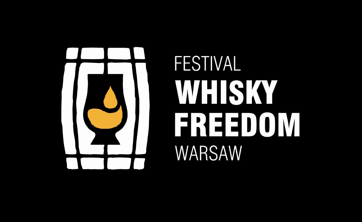
The final mark, reversed.
Print
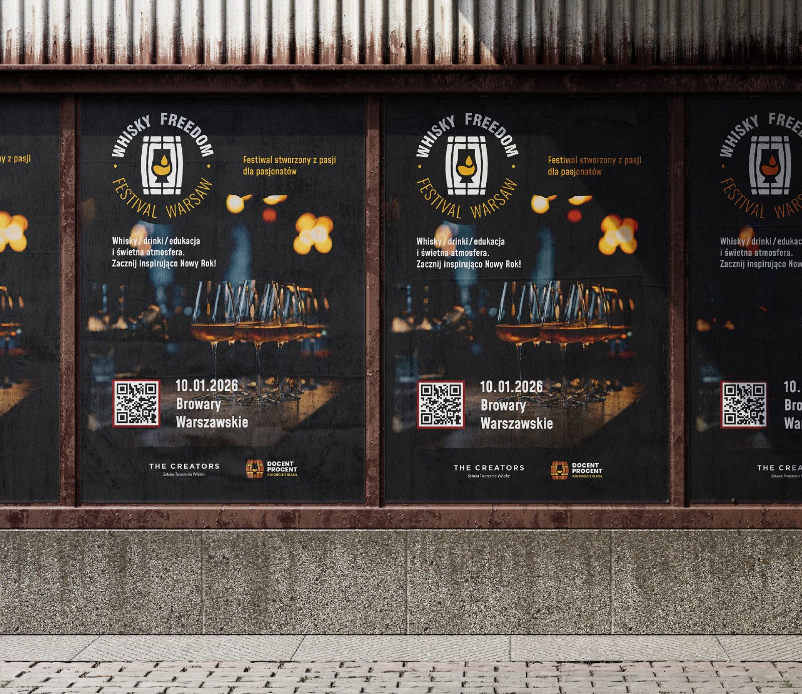
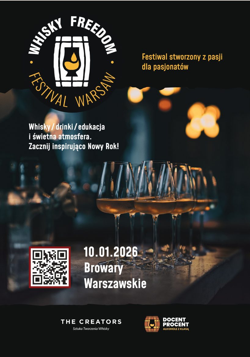
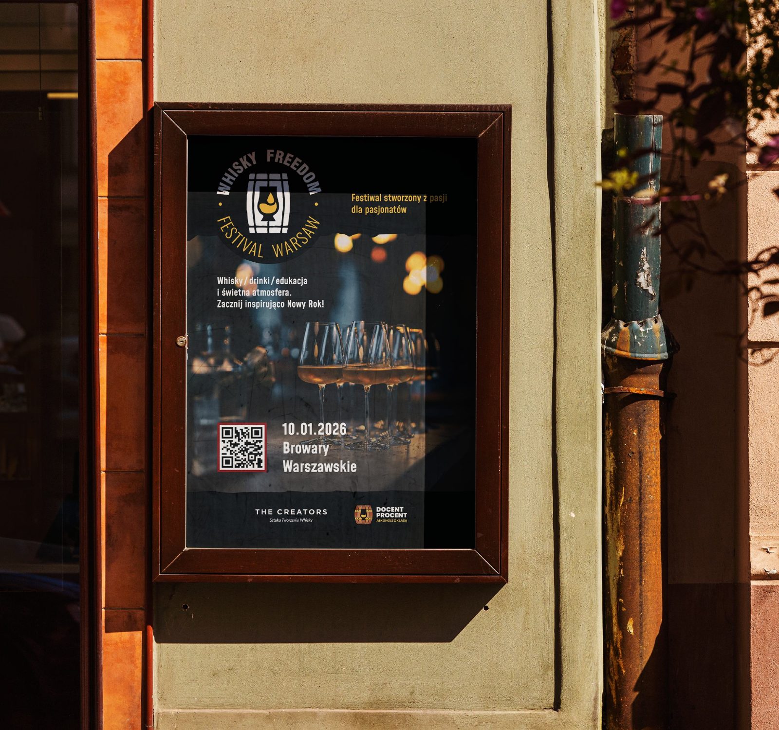
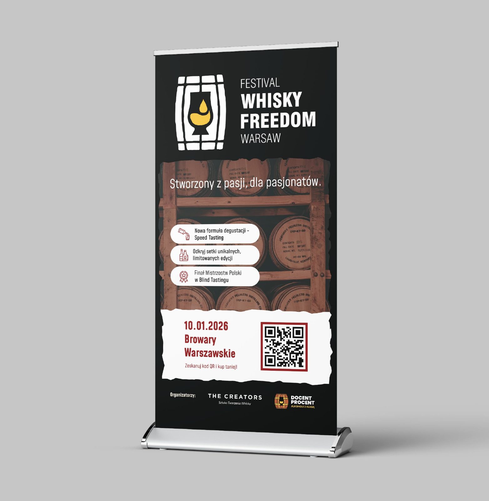
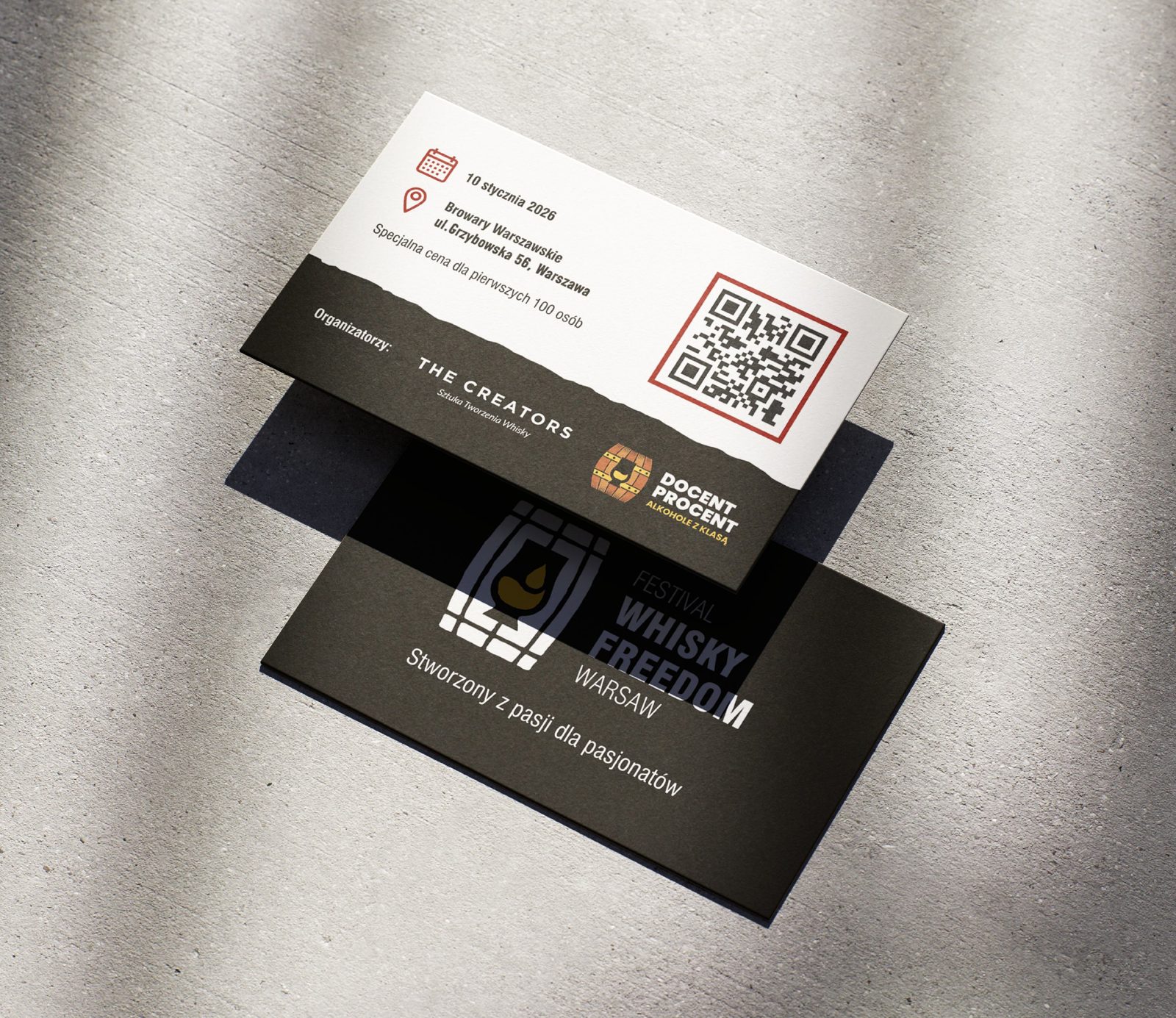
The poster sets the tone for everything else: a dark bar, glasses catching the light, the date and the venue big enough to read from across the street. The same language runs through the roll-up for the venue and the business cards, which carried a QR code and a special price for the first hundred people.
Właściciel marki whisky i właściciel sklepu z whisky postanowili zbudować wydarzenie, na które sami chcieliby pójść. Whisky Freedom Festival Warsaw. Naszym zadaniem było nadać mu twarz.
Festiwal miał jasny cel: promować polską i światową whisky, dać scenę nowym markom i zrobić miejsce na degustacje, edukację i rozmowy ludzi, których łączy ta sama pasja. Otwarty i inspirujący, ale prestiżowy. Swobodny, ale nie tani.
Koncepcja wizualna musiała więc unieść trzy słowa naraz: wolność, pasję i elegancję.
Logo
Punkt wyjścia dał klient. Jego sklep, Docent Procent, miał już w logo beczkę i chciał, żeby festiwal wyrósł właśnie z niej. Z tej beczki narysowaliśmy dwa kierunki: jeden mocny i surowy, drugi klasyczny i elegancki. Klient wybrał mocny.
Znak prostokątny i okrągła pieczęć.
Potem nie mógł się zdecydować między wersją prostokątną a okrągłą. Dostał więc obie: prostokątny znak prowadzi, a okrągły działa jak pieczęć na plakatach, naklejkach i wszędzie tam, gdzie odznaka czyta się lepiej niż linia.
Jedna beczka. Dwa kształty.
Ostateczny znak w negatywie.
Druk
Plakat nadaje ton wszystkiemu innemu: ciemny bar, kieliszki łapiące światło, data i miejsce na tyle duże, żeby przeczytać je z drugiej strony ulicy. Ten sam język przechodzi na roll-up na miejsce wydarzenia i wizytówki, z kodem QR i specjalną ceną dla pierwszych stu osób.
The poster, flat and on the street.Plakat, na płasko i na ulicy.
Roll-up and business cards.Roll-up i wizytówki.
Email
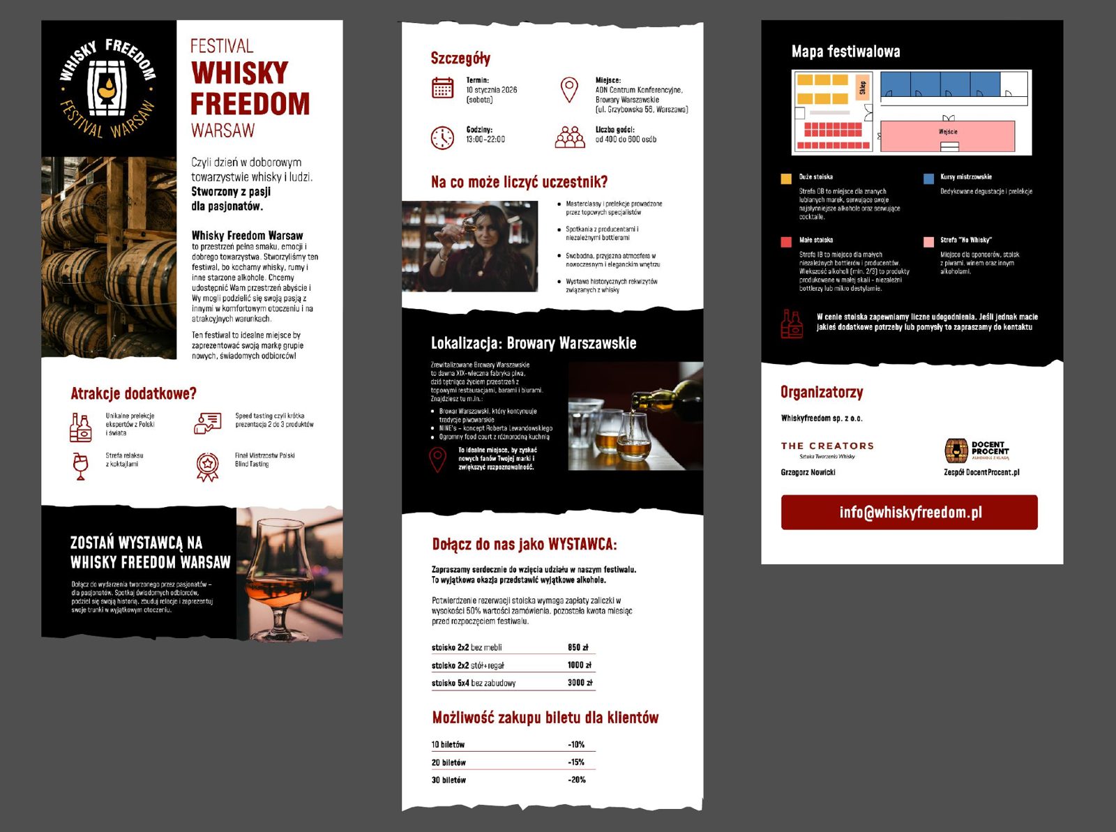
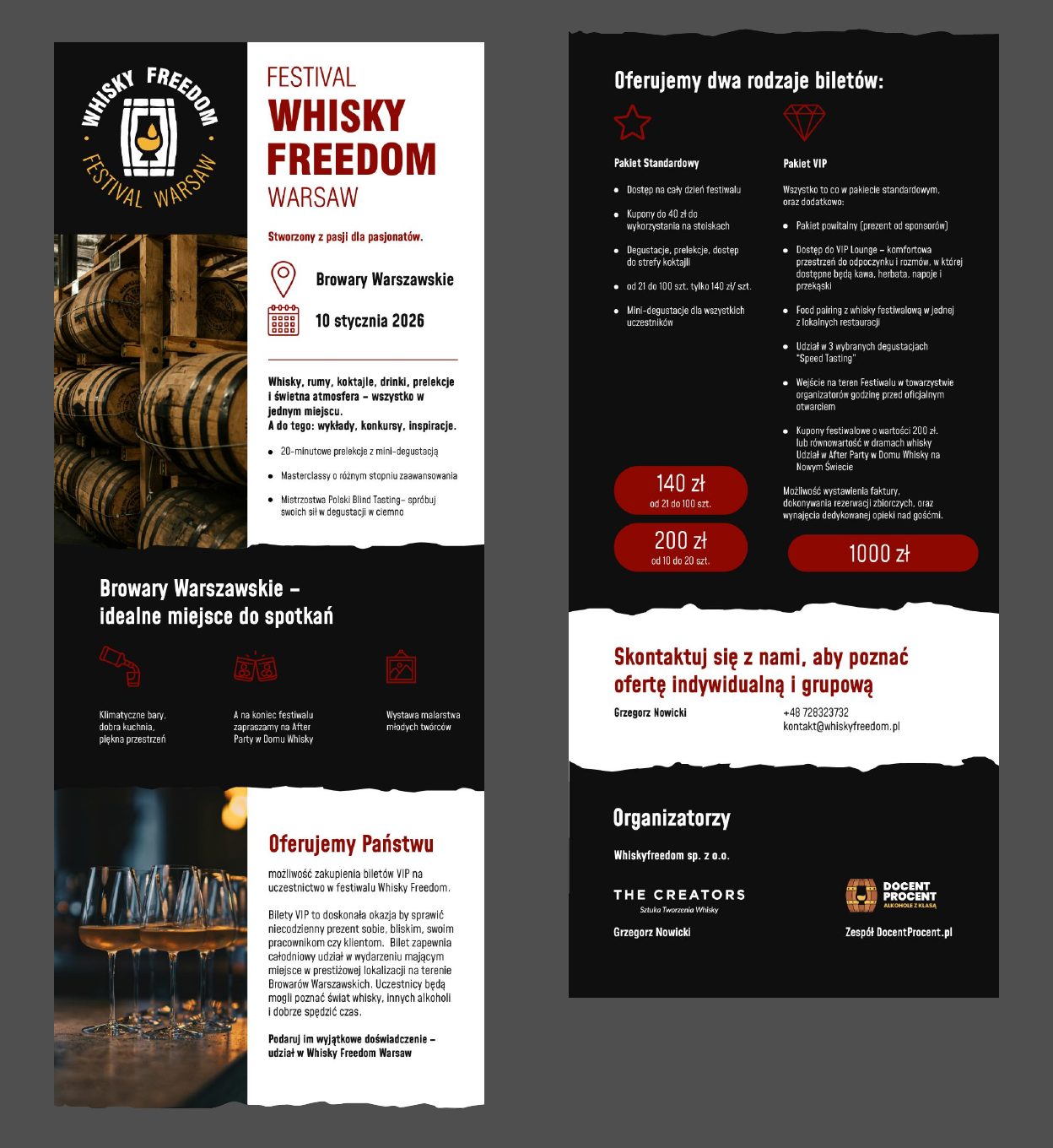
The festival needed two audiences to say yes: exhibitors and guests. Instead of a classic leaflet, we built long-form graphics that live inside a welcome email. One version speaks to whisky producers and enthusiasts who might take a stand. The second speaks to potential clients, with two packages, Standard and VIP.
Same look, different message. It let the organisers segment their list and talk to each group in its own language.
Email
Festiwal potrzebował zgody dwóch grup: wystawców i gości. Zamiast klasycznej ulotki zbudowaliśmy długie grafiki, które żyją w mailu powitalnym. Jedna wersja mówi do producentów i pasjonatów whisky, którzy mogą wystawić stoisko. Druga do potencjalnych klientów, z dwoma pakietami: Standard i VIP.
Ten sam wygląd, inny komunikat. Organizatorzy mogli podzielić swoją listę i mówić do każdej grupy jej językiem.
Email flyer for exhibitors.Mailowa ulotka dla wystawców.
Email flyer for clients: Standard and VIP.Mailowa ulotka dla klientów: Standard i VIP.
Website
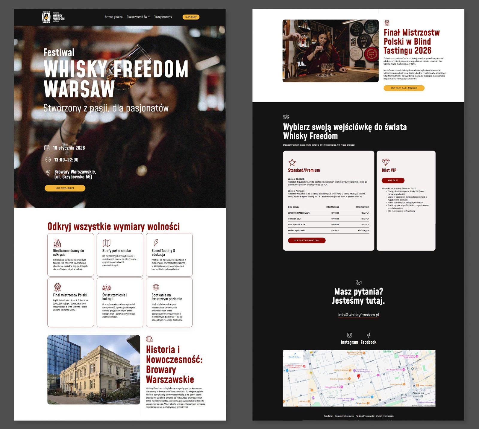
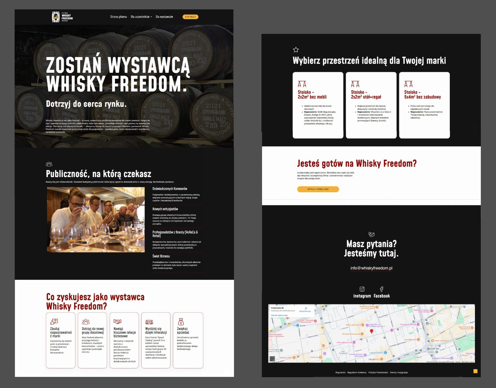
The website has two parts: the main page for guests and a separate section for exhibitors. It runs on WordPress, so the organisers can update the programme, prices and partners themselves. We started from a copywriter's guidelines and edited them so the words matched the look.
Four colours carry the whole system. White and black as the base. Brown as the complement, from the wood of the barrel. Yellow as the accent, kept for buttons and the things you're meant to click.
Strona
Strona ma dwie części: główną dla gości i osobną sekcję dla wystawców. Działa na WordPressie, więc organizatorzy sami zmieniają program, ceny i partnerów. Zaczęliśmy od wytycznych copywritera i zredagowaliśmy je tak, żeby słowa pasowały do wyglądu.
Cały system niosą cztery kolory. Biel i czerń jako baza. Brąz jako uzupełnienie, z drewna beczki. Żółty jako akcent, zarezerwowany dla przycisków i wszystkiego, co ma być kliknięte.
Main page.Strona główna.
Exhibitors section.Sekcja dla wystawców.
One barrel, carried from a logo to a poster, a roll-up, a business card, two emails and a website. The festival opened on 10 January 2026 at Browary Warszawskie.
Jedna beczka, przeniesiona z logo na plakat, roll-up, wizytówkę, dwa maile i stronę. Festiwal otworzył się 10 stycznia 2026 w Browarach Warszawskich.